Note: To comply with an NDA, I have omitted and replaced confidential information, including the company name.
CareSync
Bridging Patient Care Gaps with Innovative Technology.
Industry
Healthcare
Team
Lead Designer
Frontend Devs
Company Stakeholders
Role
Product Designer
Duration
3 months
Background
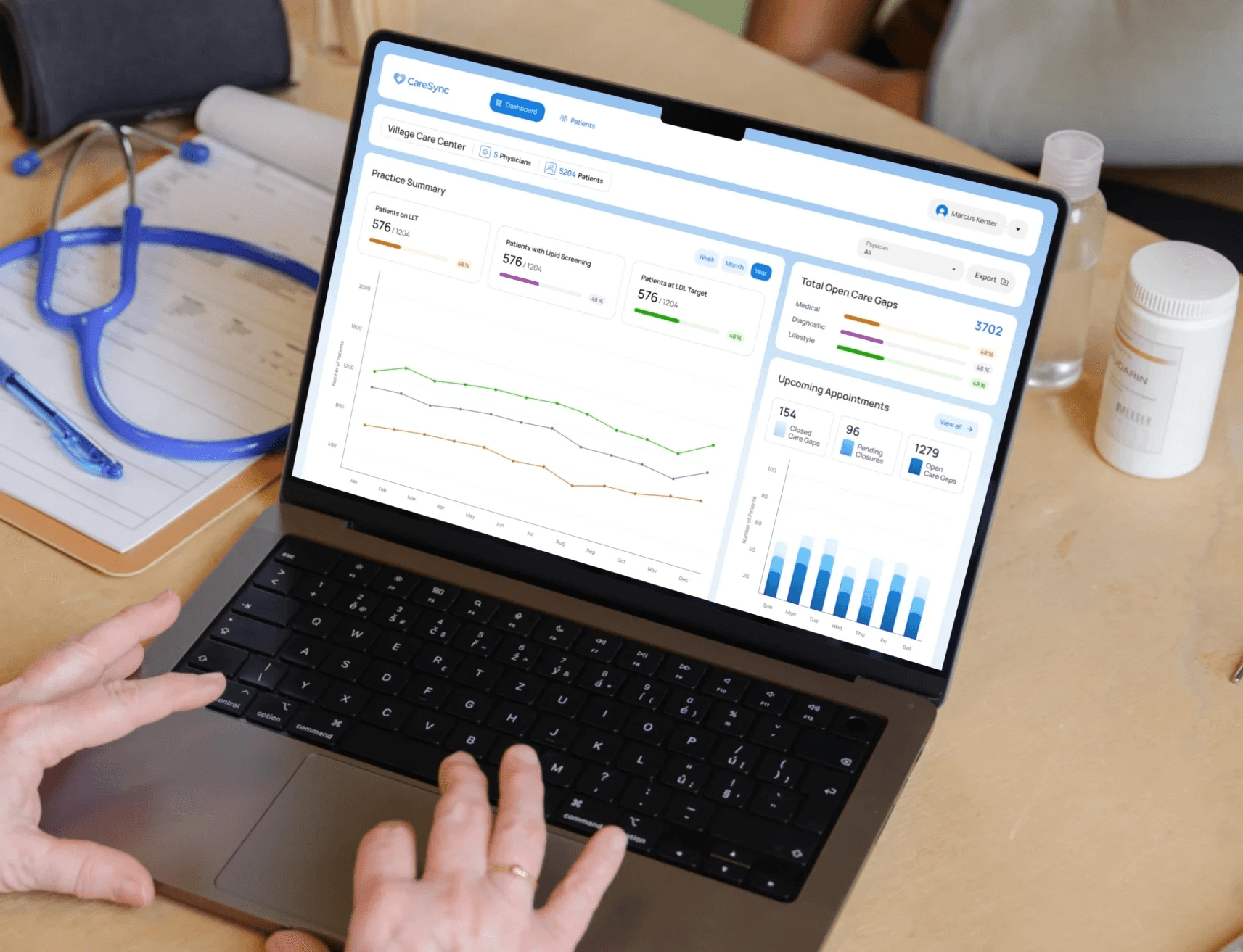
CareSync is a clinical data-driven platform that helps clinicians make the right decisions for their patients
By analyzing medical data, CareSync automates the identification of a patient's true clinical state. With a focus on providing comprehensive clinical insights, CareSync enables clinicians to identify and address guideline-directed care gaps, assess patient eligibility for clinical trials, and seamlessly integrate clinical care with research.
Project Brief
They want to create an automated engine to increase awareness of patient care gaps
In the fast-paced world of healthcare, medical societies frequently release new guidelines, making it extremely difficult and time-consuming for clinicians to keep up with the standards of care. This continuous cycle of guideline updates often leads to a buildup of care gaps within practices, posing risks to patient outcomes and adding to the workload of healthcare professionals.
To address this issue, CareSync reached out to us to create an automated engine aimed at ensuring every patient receives the attention they need according to the latest medical society guidelines. By increasing awareness of these care gaps, clinicians can prompt their closure, and ultimately improve patient care across the board.
Understanding the Users
We had to put ourselves in the user's shoes
Unfortunately we didn’t have direct access to users for insights. Instead, we relied on conversations with stakeholders to draw out the information. These discussions gave us valuable perspectives to guide our development for both the user and business. Due to the fast-paced nature of this project, we maintained daily communication with stakeholders, regularly updating them on our progress and proactively seeking their feedback.
In our discussions, we learned:
The design should be clear and actionable
Clinicians are expected to adhere to medical society guidelines but the typical care team is already extremely pressed for time. For this reason, the platform should be designed for their primary goal: to identify patient care gaps and prompt their closure as quickly and easily as possible.
The design should ensure clinician confidence and security
Clinicians must feel confident when using the platform, particularly when making critical decisions regarding patient care. Rather than simply accepting statements and performing tasks without significant understanding of the evaluation, they need to meet the needs of patients within the context. In healthcare UX, patient safety is a top priority and that should not be compromised.
The platform should gather feedback and insights from clinicians
Understanding why clinicians may choose not to accept certain recommendations can provide valuable information for refining the platform. By incorporating clinician insights, the platform can evolve to better meet the needs of its users and ultimately improve patient care.
Designing the Platform
Actionable Flags
We had to strike a balance between being informative without overwhelming users
To encourage the closure of care gaps, we considered showing flags on the patient directory. We went through numerous iterations, aiming to be actionable without burdening clinicians with too much information. After consulting stakeholders and user testing, we refined our approach and found the optimal balance that worked best.
Evidence-Based Practice
We supported guidelines with medical society sources and patient evidence
At point of care, clinicians will use the recommendations to determine the best course of action, whether it's ordering a prescription or evaluating a patient for a clinical trial. To help them make confident decisions, we provide access to the most recent medical guidelines and highlight patient-specific data to support these recommendations.
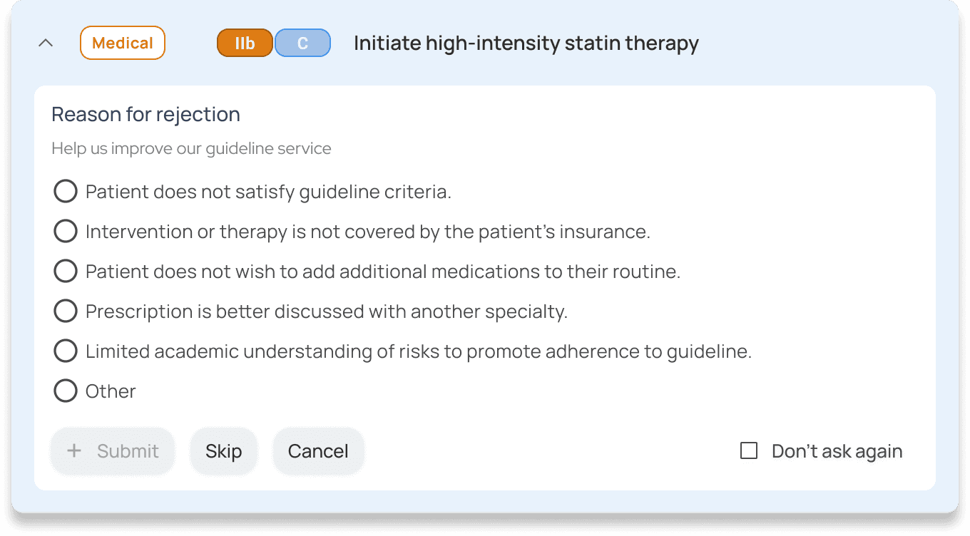
Reasons for rejection
Clinicians are prompted to provide a reason for rejecting recommendations
To continuously improve the platform and its effectiveness, we've included a feedback option for rejections. This feedback loop helps commercial teams understand the practical challenges and concerns faced by clinicians, enabling them to make adjustments that enhance the platform's usability and impact.
Design System
We built out a comprehensive design system to be used across all of Caresync's platforms
Drawing inspiration from existing public systems, we developed a design system from scratch. Our focus was on harmonizing the visual language and and improving workflow efficiency for developers, with the flexibility to scale and evolve for future projects.
Outcome
Impact
Caresync reported impressive outcomes to patient care across the board
These outcomes are the result of Stanford Health Care using Caresync to identify and address care gaps.
drop in blood pressure
decrease in 10-year cardiovascular risk
reduction in BMI
Reflection
Takeaways
Embrace the Adventure
I met inspiring people who have all pushed and guided me to grow. I came into this project thinking that I would just be working on my craft, but I also discovered opportunities to work on my soft skills, such as building confidence and improving communication.


